
Vibe-Coded Website Examples (2026): Real Sites and the Tells That Give Them Away
Real vibe-coded websites, screenshotted and reviewed — what works, the 7 tells that give them away, and how to fix yours.
Start for Free
In short
Vibe-coded website examples include personal portfolios, data-visualization projects, and startup landing pages built with tools like Claude, Lovable, Bolt, and Cursor. See six real, screenshotted sites below — three that get more right than you'd expect, three that fall straight into the 7 tells that give a vibe-coded site away.
Key takeaways
- Vibe coding means describing a website to an AI (Claude, Lovable, Bolt, Cursor) and accepting the generated code with little manual review.
- Six real vibe-coded sites, screenshotted below, show what "good" and "generic" both look like in practice.
- Seven tells reveal a vibe-coded site: gradient hero, emoji icons, interchangeable copy, stock fonts, a contact form instead of booking, generic imagery, and missing meta details.
- The free OhhWells Website Audit scores any site across 32 checks in 8 dimensions and emails a Conversion Score with a prioritized fix list.
- Vibe coding is a great way to launch a personal or test site, but a bookings-based small business still needs a brand layer and a real booking system.
A vibe-coded website is a site built by describing what you want to an AI — usually Claude, Lovable, Bolt, or Cursor — and accepting the generated code without writing it yourself. The term comes from Andrej Karpathy's 2025 coinage "vibe coding," and by 2026 it describes a real category: functional websites built in hours by people who don't code.
They work. They ship. And there's a running joke on the internet about them — which is exactly what this article is about. Below: real examples, the seven tells that give a vibe-coded site away, and what it takes to get one across the finish line.
Yes, vibe coding websites is real (and mainstream)
Quick credentials for the skeptics: the term was coined by AI researcher Andrej Karpathy in February 2025, entered Merriam-Webster as trending slang within a month, and Collins Dictionary named it Word of the Year for 2025. Y Combinator reported that a quarter of its Winter 2025 startup batch had codebases that were 95% AI-generated, and by early 2026 even Linus Torvalds — the creator of Linux — had vibe-coded a tool of his own. This is not a fringe hobby.
Most vibe-coded websites in the wild trace back to a handful of tools — and if the search data is anything to go by, Claude is the one people most associate with the term. Typical stacks: Claude or Claude Code generating the site directly, Lovable or Bolt for chat-to-published-site, Cursor for people willing to touch an editor, and Wix Vibe or Base44 packaging the same behavior inside a builder.
What vibe-coded websites actually look like: 6 real examples
We pulled six real, live vibe-coded sites — three that get more right than you'd expect, and three that fall straight into the tells below. All screenshotted directly; nothing here is invented.
Siam Ferry — island ferry booking, Thailand
Built with Bolt · Maker: Stuart Lansdale
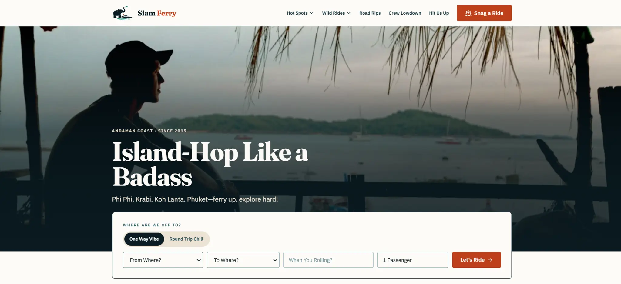
Gets right: A genuinely distinct brand voice — loud, slangy, backpacker copy ("Island-Hop Like a Badass," "Ferry Hard, Party Harder") that doesn't read as generic despite a simple, template-shaped layout.
Gives it away: Nothing obvious. This is one of the stronger examples on this list — proof the tells are a prompting problem, not a tooling one.
eden.pm — focus/productivity workspace
Built with Bolt · Maker: Hendraco
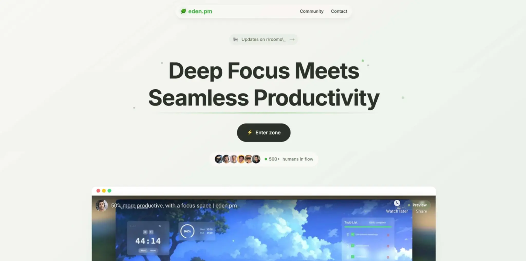
Gets right: An ambitious feature set for a solo build — ambient focus scenes, a music player, task boards, and social proof, all in one page.
Gives it away: The testimonial screenshots reference "roomo.me" — an apparently earlier product name — suggesting the copy wasn't fully updated after a rebrand. A small tell, but the kind that quietly undermines trust.
Proudwork — portfolio link-in-bio for creatives
Built with Replit · Maker: Kenny · ~20 days, $101.96
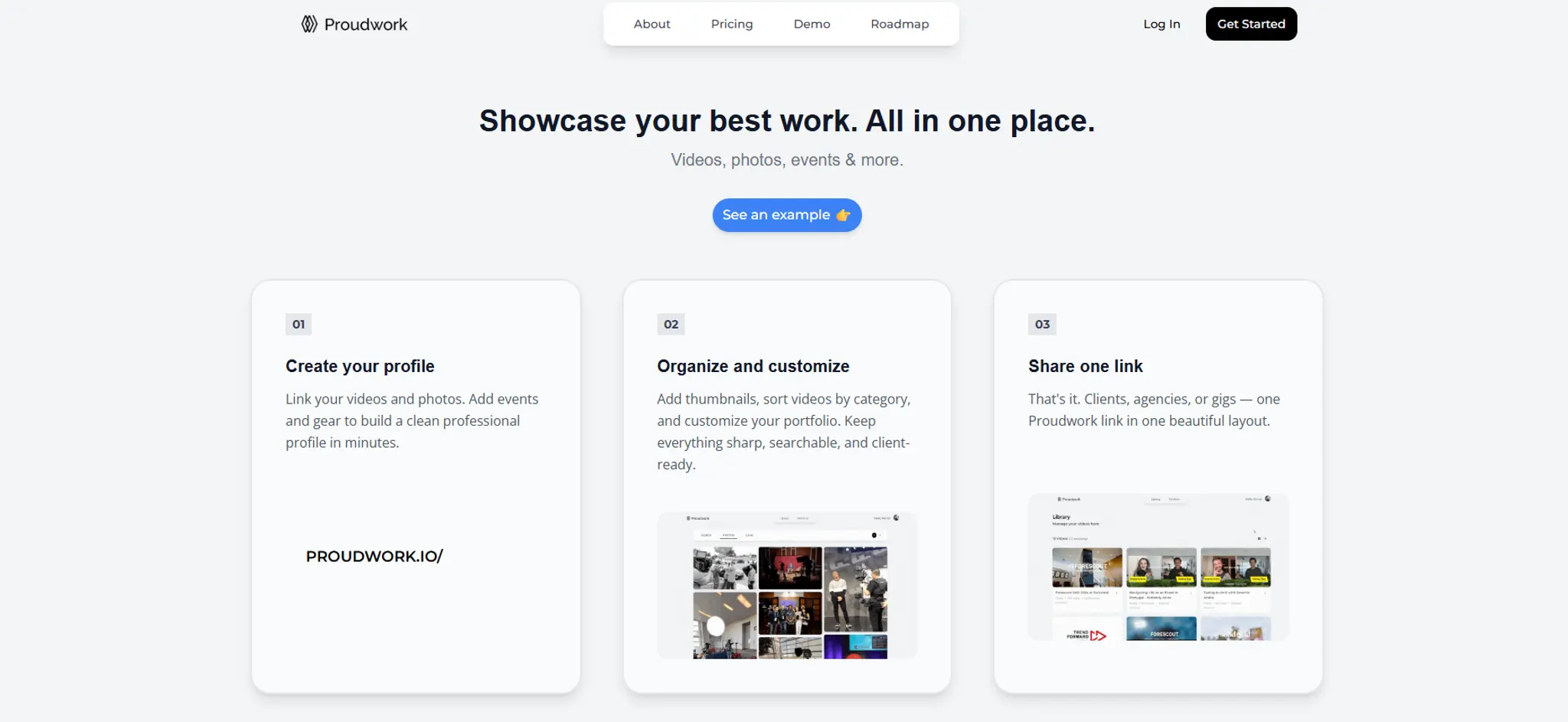
Gets right: Deliberately minimal — "free of bloat," in the maker's own words — and the page matches that pitch exactly. Built from a Canva mockup first, then prompted, which is the right order.
Gives it away: Very sparse. Reads as intentional here, but this is the exact same pattern that reads as "unfinished" when it isn't a deliberate choice.
Openmark — free open-source logo gallery
Built with Bolt
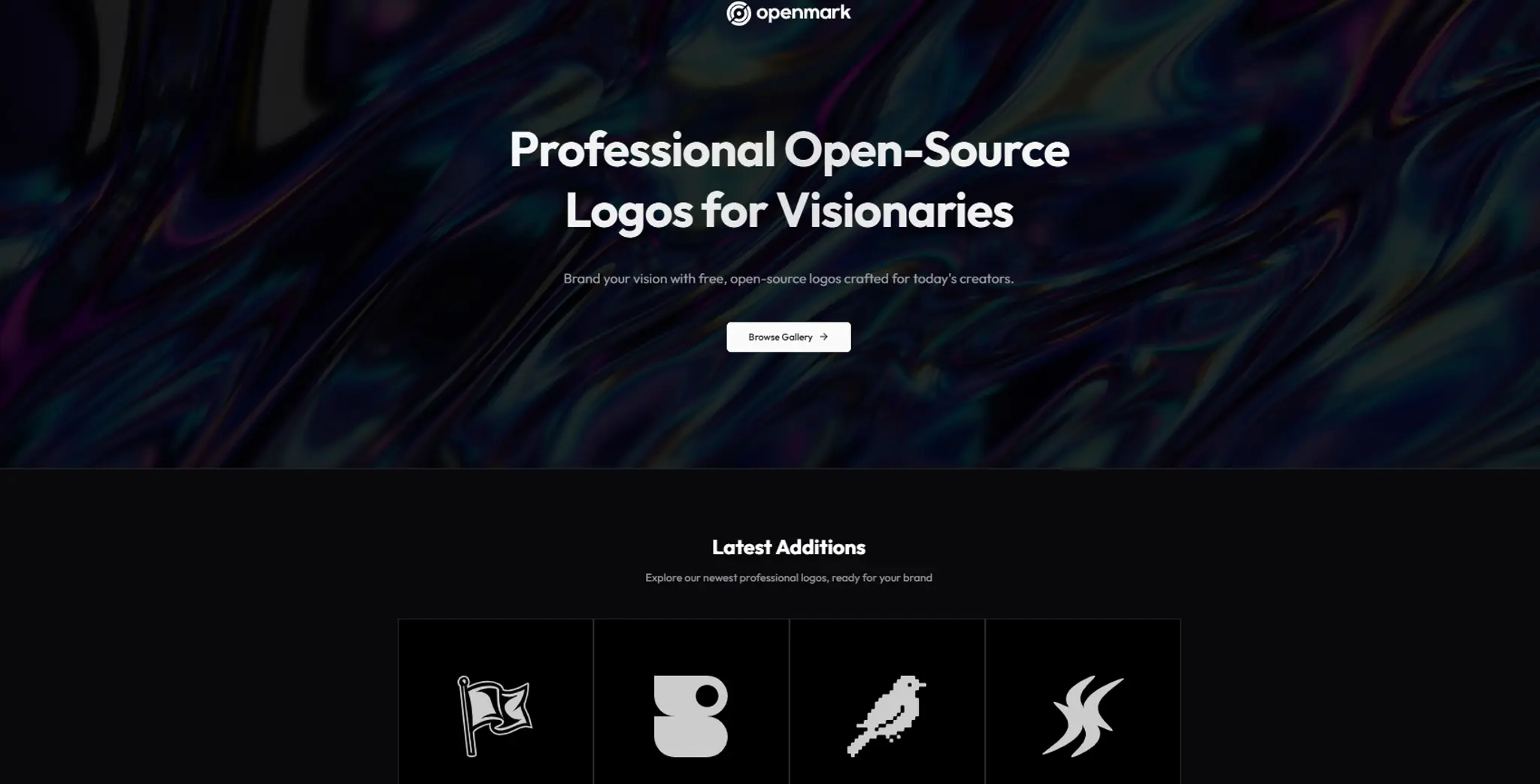
Gets right: Clean dark theme, one clear offer, confident type.
Gives it away: A generic 4-icon feature grid ("Everything You Need") that could belong to any product, plus a glitchy repeated "Latest Additions" heading — the kind of finish-line detail AI skips because nobody prompted for it.
NewMom AI — AI chatbot companion for new mothers
Built with Bolt and Supabase · Maker: Zeng
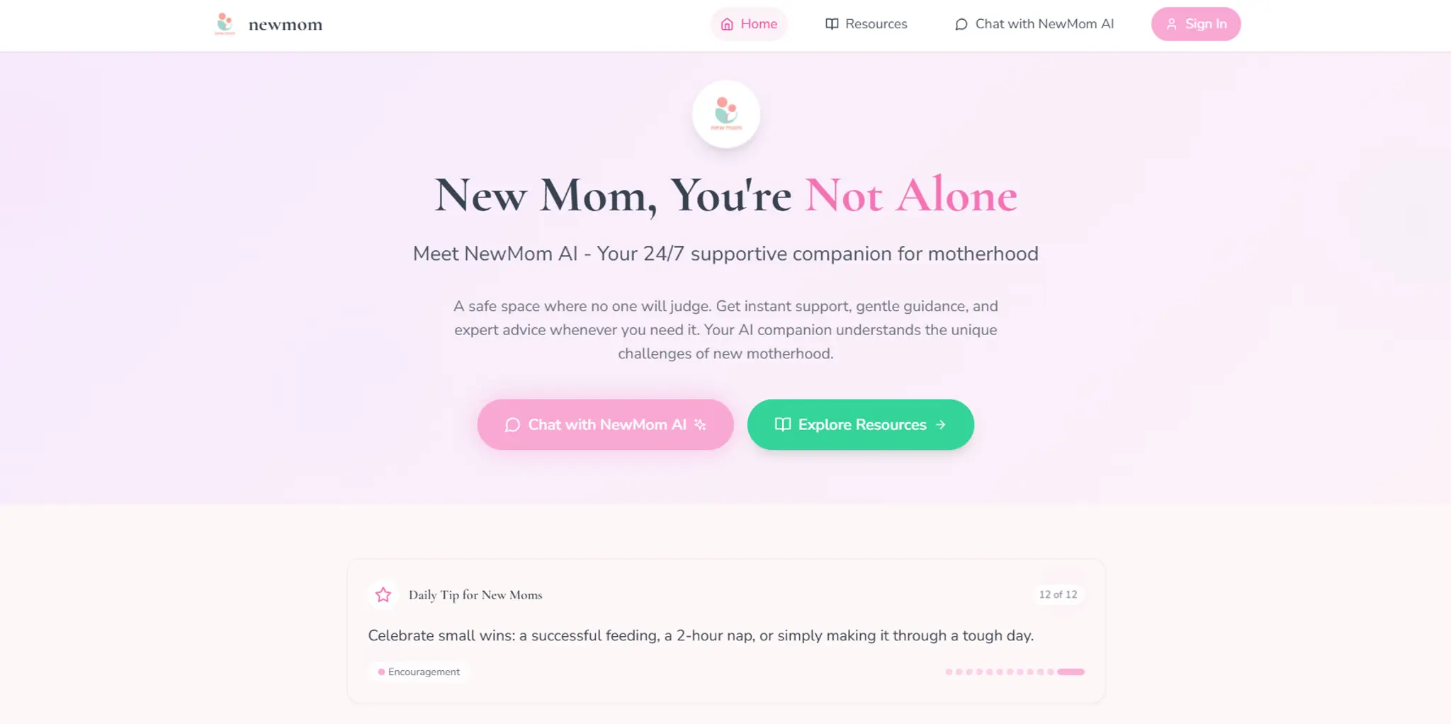
Gets right: A warm, empathetic tone genuinely well-matched to a sensitive audience.
Gives it away: The textbook purple-to-pink gradient hero, a generic 4-card icon grid, and a founder photo in the "About" section with that unmistakable stock-photo sheen.
vibe-coded.lol — the joke, made real
Built with Claude
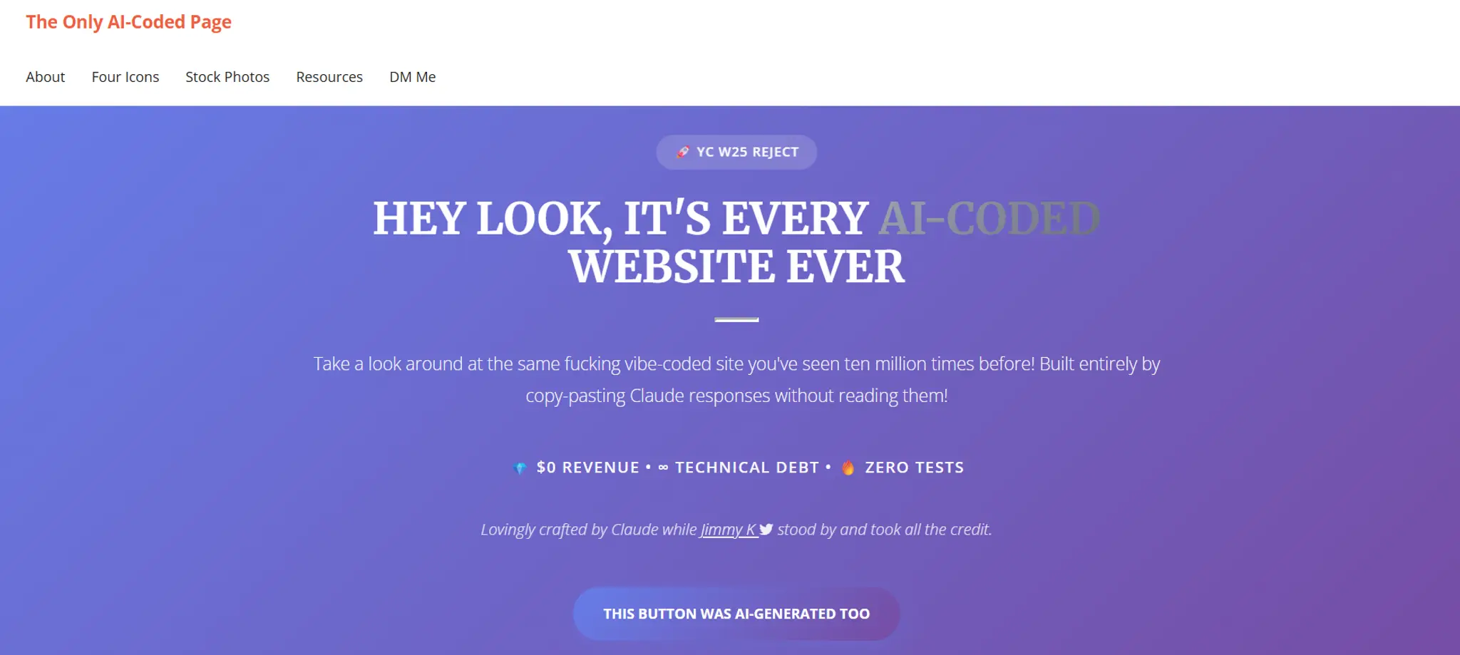
Gets right: Nothing — and that's the point. It's a shockingly accurate parody: "$0 revenue · Technical debt · Zero tests," a button labeled "THIS BUTTON WAS AI-GENERATED TOO," and a metrics section proudly reporting NaN% customer satisfaction.
Gives it away: All seven tells at once, deliberately — gradient hero, emoji-adjacent icons, fake testimonials, a "trusted by" section, broken-feeling links, generic stock photography, and copy that means nothing. If you want a checklist of what not to do, this page is it.
The 7 tells of a vibe-coded website
If you want to know whether a site was vibe-coded — including your own — look for these:
- The gradient hero. Purple-blue gradient, oversized headline, two buttons. The default aesthetic of every code-generating model. (See: NewMom AI, vibe-coded.lol above.)
- Emoji as icons. 🚀 for launch, ⚡ for speed, 🔒 for security. AI reaches for emoji when nobody supplies brand icons.
- Interchangeable copy. "Empowering businesses with innovative solutions." Swap the logo and it's a different company. Nothing about this business survives.
- Same fonts everywhere. The stock font pairing of the frameworks AI defaults to, untouched.
- A contact form where a booking system should be. The AI can't set up your scheduling, deposits, and reminders — so it gives you a form and moves on.
- Stock-adjacent imagery. Generated or generic photos of laptops and smiling teams that belong to no one. (See: vibe-coded.lol's landscape grid above.)
- No favicon, default meta tags, missing alt text. The finish-line details AI skips because you didn't prompt for them — and they quietly cost you SEO and polish.
None of these mean the site is broken. They mean the site is anonymous — and for a small business, anonymous doesn't convert.
The finish-line gap: from "it works" to "it's mine"
Here's the pattern in every honest vibe-coding writeup, including the enthusiastic ones: getting to a working site is fast; getting to a finished one isn't. The Medium writer needed 13 days plus three more weeks for one mobile fix. The last 20% — brand, polish, conversion — is where prompts stop helping, because the AI has never met your customers and doesn't know why anyone chooses you.
We call that missing layer brand conversion: your voice in the copy, your visual identity replacing the defaults, and conversion mechanics — one clear offer, trust signals, a real booking path — on every page. It's the layer OhhWells adds on top of whatever the AI generated, whether that came from Claude, Lovable, or anywhere else.
Find out where your site stands in two minutes: run the free OhhWells Website Audit. It scores any site — vibe-coded or not — across 8 dimensions and 32 checkpoints and emails you a Conversion Score with a prioritized fix list. Most vibe-coded sites score high on speed and low on brand and booking; the fix list shows exactly which of the seven tells are costing you.
Should you vibe code your website?
Honest answer by situation:
- Testing an idea, personal site, side project — absolutely. It's the fastest, cheapest way to get something live, and you'll learn a lot.
- Small business that lives on bookings — vibe code the draft if you enjoy it, but plan for the two things prompts won't finish: an on-brand look and a real booking system. Or start on a platform where both are native.
- You want it done, not a project — skip the prompting; a done-for-you build gets you a site that's on-brand from day one.
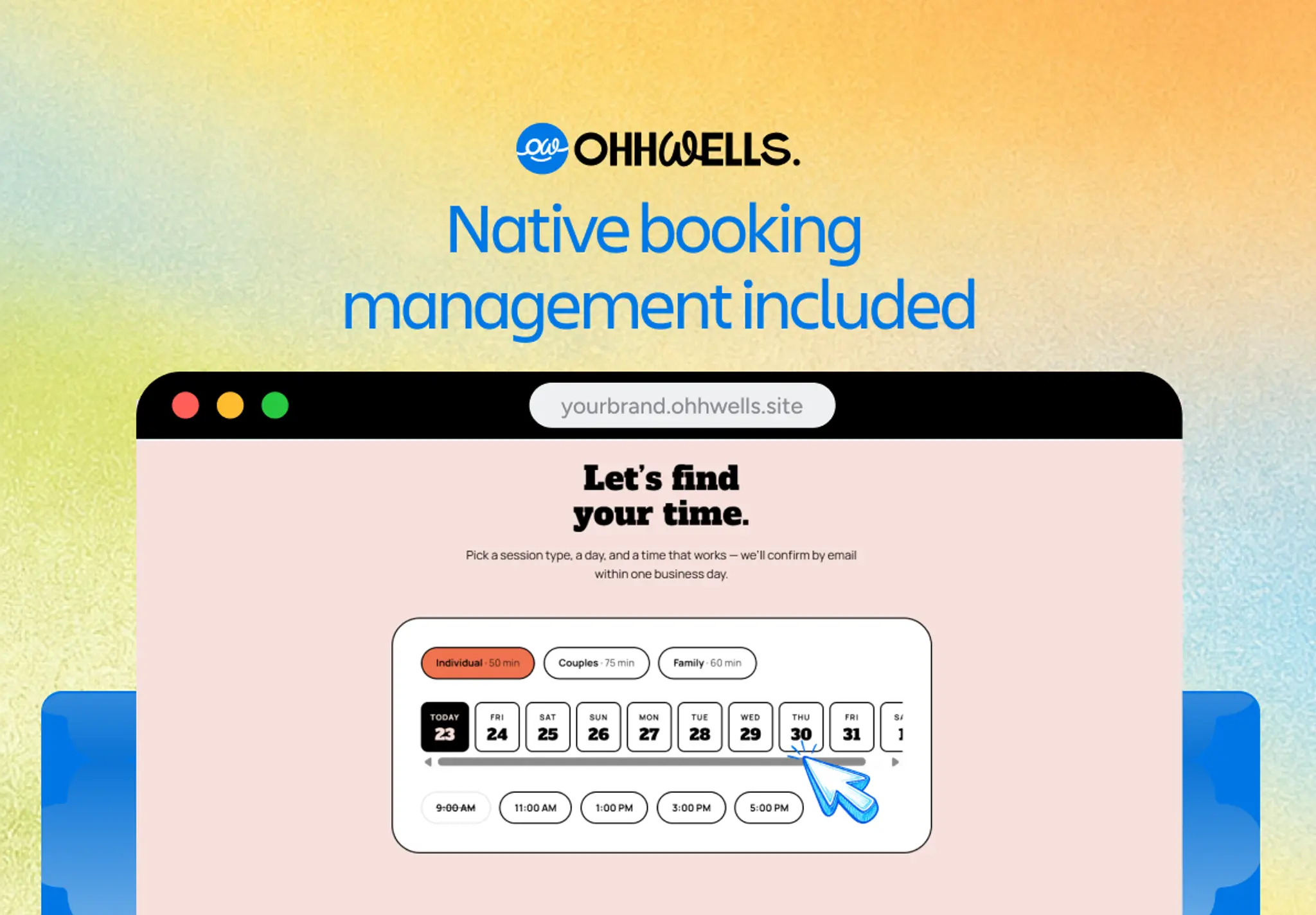
If you do go the prompting route, prompt quality decides output quality — "make me a nice website" is how the gradient-and-emoji clone gets born. Grab our free prompt playbook — the copy-paste prompts we use to push AI output away from the defaults, grouped by site type.
Frequently asked questions
Keep reading
Does Your Website Look AI-Generated? A 4-Point Check
Run four quick checks on your homepage to see if it looks AI-generated, from copy to photos, plus a simple fix for each one so it looks like your business.
Leaving Squarespace? How to Move Your Website Without Losing Your Google Ranking (2026)
Squarespace only exports part of your site. Here's what you can take with you and how to move step by step without losing your Google ranking.
Leaving Wix? How to Move Your Website Without Losing Your Google Ranking (2026)
Wix doesn't let you export your whole site. Here's what you can take with you and how to move off Wix step by step without losing your Google ranking.
Leaving WordPress? How to Move Your Website Without Losing Your Google Ranking (2026)
Thinking of leaving WordPress? Here's how to move your website step by step without losing your Google ranking, your domain or your email.
Why AI Websites All Look the Same (And How to Make Yours Look Like Your Brand)
AI websites look the same because tools share training data, component libraries, and vague prompts. Here's the five-step fix that works in any tool.
How to Use AI to Design Website Sections (Step-by-Step, With Prompts That Work)
A step-by-step guide to designing website sections with AI — set your brand first, then prompt one section at a time. Includes copy-paste prompts.