
The State of Small Business Websites in Southeast Asia 2026
67% of small businesses we met have no website. The 33% that do score 37/100. Here's how to do better either way.
Start for Free
In short
We interacted with 180 small-business owners at the 2026 Asia Business Show in Singapore — 67% didn't yet have a website. Of the 59 that did, we audited every one and found an average Conversion Score of 37.5/100, with missing pricing, FAQs, and calls-to-action the most common failures.
Key takeaways
- The average small-business website in Southeast Asia scores 37.5 out of 100 on OhhWells' Conversion Score, with a median of 38. Only 6 of 59 sites (10%) scored 52 or above.
- Sites pass barely a fifth of the 32 conversion checks. The average site passes just 5.9 of 32 checks (18%), and 42 of 59 sites (71%) pass fewer than 8.
- Objection Handling is the weakest dimension by far, averaging 27.9/100. Nearly three-quarters of sites (73%) scored 30 or below on it — most commonly because there's no pricing or cost information anywhere on the page, and no FAQ or objection-handling content at all.
- Call-to-Action Effectiveness is nearly as broken: half of all sites (51%) scored 30 or below, typically because there's no primary CTA above the fold.
- Fintech and payments companies scored highest of any vertical we could group with confidence (54.0/100 average, n=5), while Technology/IT services scored lowest among named verticals (31.2/100, n=6) — though sample sizes here are small and directional, not definitive.
- What separates the top decile from the median isn't one thing — it's Objection Handling. Top-scoring sites (62.0/100 average) beat median-band sites by 36 points on that dimension alone, more than double the gap on any other dimension.
- The most surprising finding: even the highest-scoring site in the entire sample (72/100) still failed its "hero image or video present" check — suggesting that even well-built small-business sites in this market skip a basic visual conversion element that larger competitors take for granted.
No website yet?
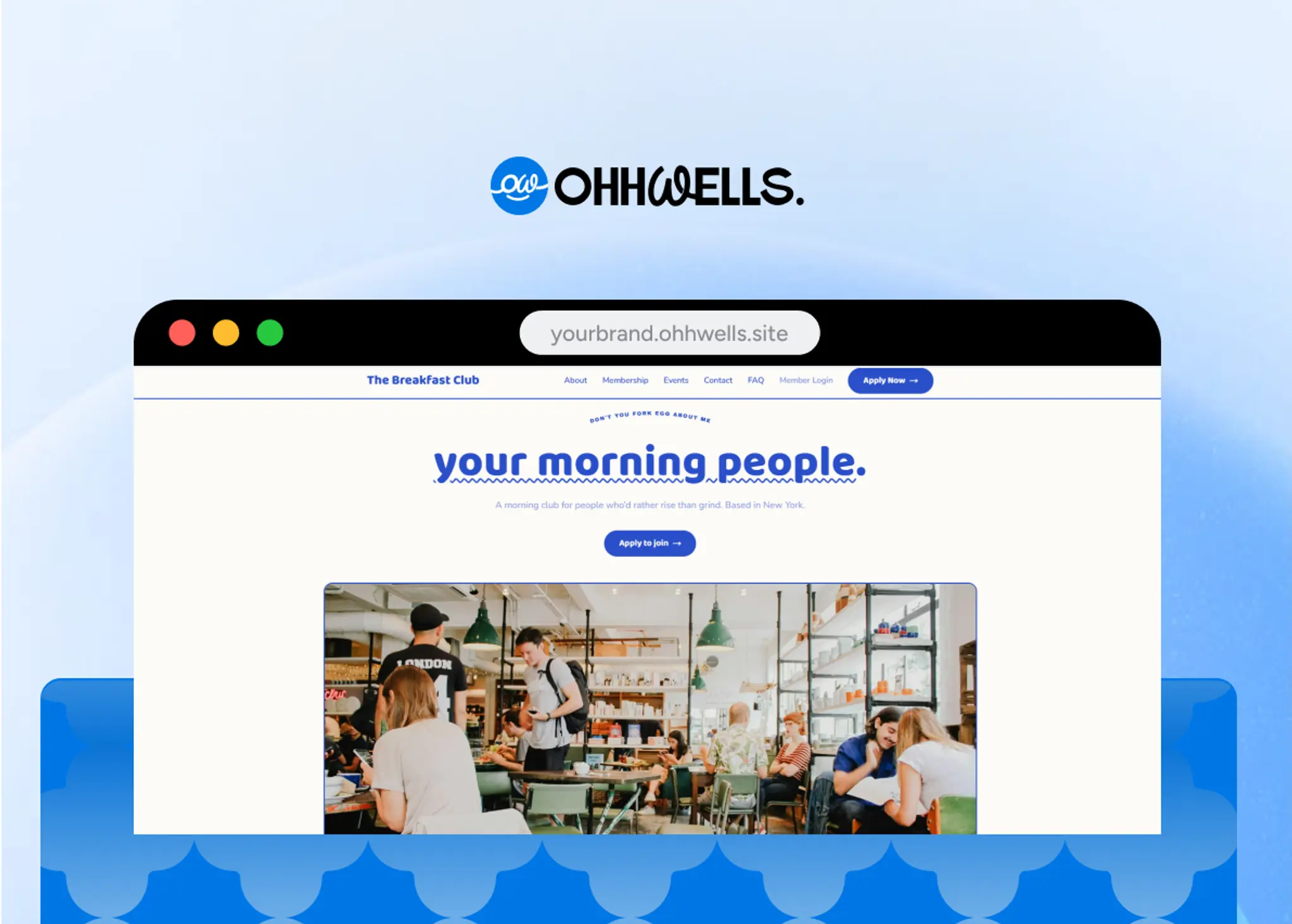
Start with a free OhhWells site that already passes these checks — every template ships with a hero CTA, an inline contact form, and a pricing section built in.
Build my site free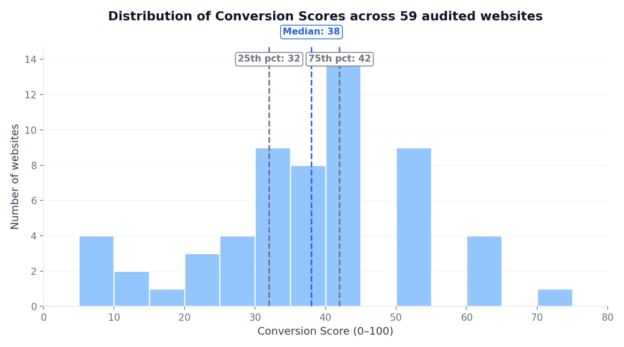
What is the Conversion Score?
The Conversion Score is a 0–100 rating of how effectively a small-business website turns visitors into enquiries or customers. It evaluates 32 checks across 8 dimensions: Value Proposition Clarity, Headline & Messaging, Call-to-Action Effectiveness, Visual Hierarchy & Scannability, Trust Signals & Social Proof, Brand Consistency & Identity, Objection Handling, and Friction & Page Experience. It's generated by OhhWells' free website audit tool and benchmarks small-business sites on the factors most associated with conversion.
Each dimension carries a different weight toward the final 0–100 score, reflecting how much conversion impact it typically has:
(Weights above are read directly from the tool's own audit output and sum to 100%. One nuance worth flagging: Objection Handling carries the smallest weight of the 8 dimensions, yet it's the single largest gap between top and median performers — see "What do the top 10% do differently?" below.)
How do SEA small-business websites score overall?
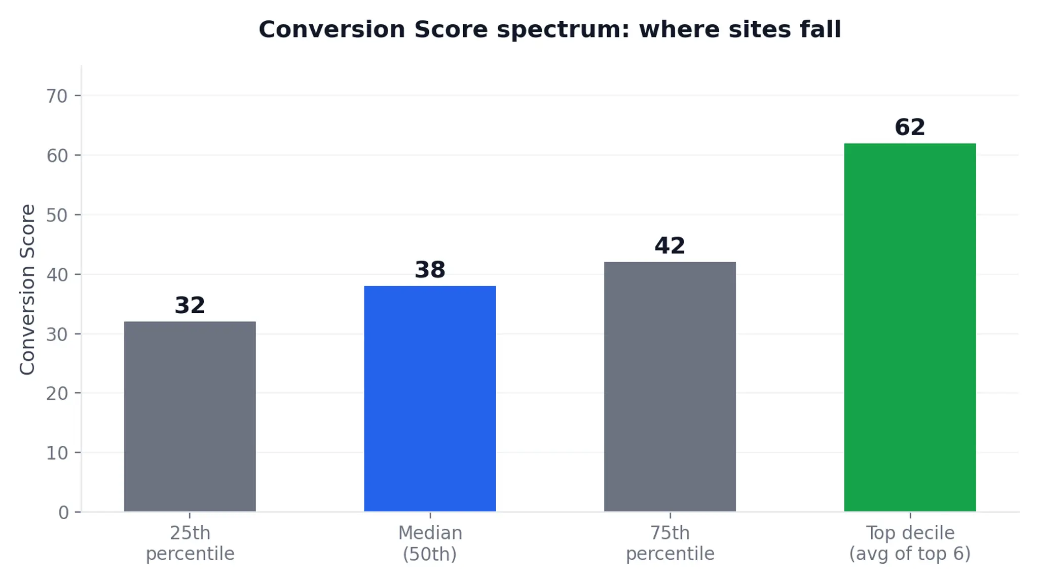
The average Conversion Score across all 59 audited sites is 37.5/100, with a median of 38. That's a low bar: on this scale, a "passing" score in the 50s still reflects fewer than half the checks passing. The spread is wide — scores ranged from 8 to 72 — but the bulk of sites cluster in a narrow, unhealthy band.
Check where your site stands with our free website audit.
Half of all sites scored between 32 and 42 (the 25th–75th percentile range), meaning most small-business websites in this sample aren't catastrophically broken, but aren't functioning as conversion tools either — they're informational brochures at best. The bottom of the distribution is genuinely broken: 4 sites scored 8/100, each with 0–2 of 32 checks passing and content that in some cases wasn't rendering at all.
Which parts of their websites do small businesses get wrong most?
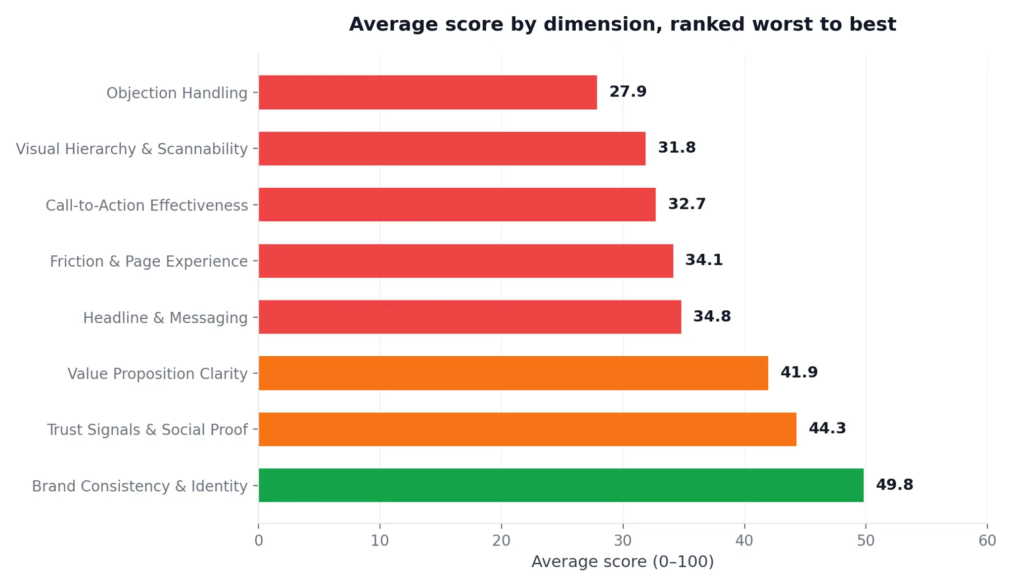
Objection Handling is the worst-performing dimension across the entire sample, averaging 27.9/100 — the only dimension where a majority of sites scored in the "critical failure" range.
Objection Handling — average 27.9/100
73% of sites scored 30 or below on this dimension. The single most common failure: no pricing or cost information anywhere on the page, often paired with no FAQ or objection-handling content of any kind — visitors are left to guess at cost, process, or risk before they'll ever pick up the phone. What good looks like: State a price range, starting cost, or "get a quote in X hours" promise above the fold, and answer the 2–3 objections that come up most in sales conversations directly on the page.
Visual Hierarchy & Scannability — average 31.8/100
A recurring pattern here is pages that load without a confirmed hero image or video — the single most common specific failure, appearing even on some of the highest-scoring sites in the sample. What good looks like: Lead with one clear hero visual that loads reliably across browsers, and make sure the page's visual weight matches what you want visitors to notice first.
Call-to-Action Effectiveness — average 32.7/100
51% of sites scored 30 or below. The most common failure: no primary call-to-action above the fold — visitors have to scroll and hunt to find out how to take the next step. What good looks like: Put one specific, action-oriented CTA (not "Contact Us") in the hero section, and repeat it at least once further down the page.
Friction & Page Experience — average 34.1/100
The most common concrete failure is the absence of an inline contact or lead-capture form on the page — forcing visitors to a separate contact page, or offering no form at all. Overloaded, 30+ link navigation menus were the second most common complaint. What good looks like: Put a short inline form (name, contact detail, one qualifying question) directly on the page where the visitor is already convinced, and keep primary navigation to 5–7 items.
Headline & Messaging — average 34.8/100
A missing or empty H1 tag was the single most common failure across the entire sample — appearing on sites at every score level, not just the lowest performers. What good looks like: Every page needs one H1 that states a concrete benefit in plain language — not a brand name, not a slogan, a benefit.
Value Proposition Clarity — average 41.9/100
27% of sites scored 30 or below. The most common failure: no unique differentiator stated anywhere on the page — the copy describes the category ("we provide consulting services") without saying why this business over any other. What good looks like: Name the one thing that makes the offer different — a number, a guarantee, a method — in the first screen visitors see.
Trust Signals & Social Proof — average 44.3/100
25% of sites scored 30 or below. The dominant failure pattern: no client logos, testimonials, or named social proof anywhere on the page — even for firms (several law firms and consultancies in this sample) that plausibly have well-known clients they could name. What good looks like: Add at least 2–3 named client logos or a specific testimonial with a name and role attached — generic "5-star" badges test worse than one credible name.
Brand Consistency & Identity — average 49.8/100
The strongest-performing dimension overall, but still short of a passing bar. Where it broke down, it was almost always inconsistent brand naming or visible spelling errors — one site's hero section referred to the business by a different name than its own domain; another had a typo in a primary heading. What good looks like: Do a single-page consistency pass — company name, logo, and taglines should match exactly everywhere they appear, including in copy.
Which industries have the best (and worst) websites?
This sample was sourced from a single Southeast Asian B2B trade show rather than a general small-business population, so the industry mix skews toward professional and B2B services rather than consumer categories like salons or fitness studios. Verticals below are grouped only where sample size supports a reading — thinner categories (staffing/HR, healthcare, hospitality, F&B, construction, real estate, agriculture, and unclassifiable sites) are folded into "Other."
Fintech and payments companies scored highest of any group we could isolate with a reasonable sample — likely reflecting more mature marketing operations at these (generally larger, better-funded) businesses relative to the rest of the sample. Professional services — law firms, consultancies, and advisory shops — scored below the overall average despite often having the most to gain from a credible web presence; several firms in this group had zero client-facing social proof despite plausibly having recognizable clients they could name.
One consistent pattern across every industry group, without exception: Objection Handling was the weakest dimension. This wasn't a vertical-specific problem — it's systemic across the whole sample.
How do websites compare across Southeast Asia?
We can't respond to this fully — country identification for this dataset is too thin to support a real regional comparison, and we're not going to force a chart out of it.
Only 6 of 59 sites (10%) could be confidently mapped to a country other than Singapore, based on domain TLD or company registration naming (Philippines: 3, Indonesia: 1, Malaysia: 1, India: 1). A further 20 sites (34%) were confirmed as Singapore-based via .sg or .com.sg domains. The remaining 33 sites (56%) — mostly .com or other generic domains — could not be confidently assigned a market from the screenshot alone.
Because the audits were sourced from a single Singapore-based trade show, it's likely many of the unconfirmed sites are also Singapore-based small businesses, but we won't assert that without domain or registration evidence. Singapore-confirmed sites averaged 40.9/100 versus 37.5/100 for the full sample — directionally higher, but on a subset small enough (and selected on domain visibility rather than randomly) that we're not presenting it as a real country comparison.
If a future edition of this report is built on a data source with better country coverage, this section should include the full regional chart and per-market table the standard structure calls for. For this edition, we're flagging the gap rather than filling it with a chart that would overstate what the data supports.
What do the top 10% of websites do differently?
The six highest-scoring sites in the sample (72, 62, 62, 62, 62, 52 — averaging 62.0/100) pass an average of 12.8 of 32 checks and carry just 1.3 critical issues each, compared to 5.5 checks passed and 4.9 critical issues for sites in the median band (36–42), and 1.9 checks passed with 8.2 critical issues for the bottom 10 sites.
The gap isn't evenly spread across dimensions. Ranked by size of the gap between top performers and the median band:
Objection Handling is the single biggest differentiator between top and median sites — a 36-point gap, more than 40% larger than the next-biggest gap (CTA effectiveness). Top-scoring sites are correlated with actually addressing pricing, risk, and common concerns on the page; median sites almost universally leave this blank. This is a correlation observed in the data, not a claim that fixing this one dimension alone would move a site from median to top decile — top performers were stronger across all 8 dimensions simultaneously, not just this one.
Want a site that does all eight?
Templates on OhhWells include pricing, FAQ, and CTA sections by default — you fill in the blanks.
Check out our templatesWhat's next: five predictions for small business websites in 2027
1. Pricing on the page stops being optional
Nearly three-quarters of sites we audited show no cost information at all. That was survivable when a visitor's only alternative was to call you. It isn't anymore — buyers now ask ChatGPT or Google "how much does a [service] cost in Singapore" before they ever land on your site, and a page with no number gets skipped, not enquired about. Expect the businesses that publish a starting price or range to pull ahead fast. Do this: put a "from $X" or "quote within 24 hours" line in your hero.
2. Sites that look AI-generated will start losing visitors.
Anyone can now ship a clean page in ten minutes — which means visitors have seen that same page a hundred times. The purple gradients, the three-card grid, the stock hero: readers are learning to recognise a template and leave before reading a word. Our data already hints at it: Brand Consistency was the strongest dimension in the sample, yet even the top site skipped a real hero image. In 2027 the sites that hold their own colours, typography and voice across every page will keep visitors; the ones that look like every other AI build will bounce. Do this: pick your brand palette and fonts once, then make every section — including AI-generated ones — inherit them.
3. "Contact us" stops being a call-to-action
Half of sites had no clear call-to-action above the fold, and where one existed it was usually generic. In 2027 the winners will replace one vague button with a specific next step — book a slot, get a quote, download the price list — and put a short form right there on the page. Do this: one action, named for what the visitor gets, repeated twice.
4. Objection handling becomes the biggest lever, not trust badges.
Everyone talks about testimonials. But the gap between top-10% sites and the median was 36 points on Objection Handling versus 20 on Trust Signals. Answering "what does it cost, how long does it take, what if it doesn't work?" beats another five-star badge. Do this: write down the three questions you answer on every sales call and put them on the homepage.
5. Answer engines reward the boring basics.
A missing H1 was the single most common failure in the sample. That's the same tag AI search engines read first to decide what a page is about. Sites that state plainly what they do, for whom, and at what price will get cited by AI answers; sites that lead with a slogan won't. Do this: one H1 per page, written as a benefit, not a brand name.
Methodology
Sample: 59 small-business websites, all belonging to businesses encountered at The Business Show Asia on Aug 26–27, 2026. Websites were audited using OhhWells' free website audit tool.
Audited on: Sep 3, 2026
Instrument: OhhWells Conversion Score — 32 automated checks across 8 dimensions.
Scoring: Each dimension is weighted as follows: Value Proposition Clarity 20%, Call-to-Action Effectiveness 18%, Headline & Messaging 15%, Brand Consistency & Identity 15%, Trust Signals & Social Proof 10%, Friction & Page Experience 10%, Visual Hierarchy & Scannability 7%, Objection Handling 5%. These weights are read directly from the audit tool's output and sum to 100%; the exact formula for how individual check pass/fail results roll up into each dimension's 0–100 sub-score was not available to us at time of writing and should be confirmed with product/engineering before publishing a precise scoring methodology claim.
Limitations:
- Self-selection bias: every business in this sample opted to attend a trade show and have their site audited; results are not representative of SEA small businesses broadly.
- Single-event sourcing: all businesses came from one trade show, likely skewing the sample toward Singapore and toward B2B/professional-services categories rather than consumer categories like salons or fitness studios.
- Country data is thin: only 6 of 59 sites (10%) could be confidently assigned to a non-Singapore market; 33 sites (56%) had no confirmable country signal at all. We have not published a country-comparison chart for this reason (see "How do websites compare across Southeast Asia?" above).
- Industry classification is inferred, not self-reported — verticals were assigned based on domain name, business name, and page content, and several sites' true industry remains ambiguous (folded into "Other").
- A display quirk in the audit tool was observed on the lowest-scoring sites: when a site has almost no usable content (0–2 checks passing), the "Top Priorities to Fix First" list sometimes surfaces positively-phrased check names (e.g., "Clear value proposition present") rather than failure descriptions, apparently as a fallback when there's no specific failure text to generate. This appears to be a tool display behavior on near-empty pages, not a claim about those businesses, and did not affect the numeric scores used in this analysis.
- No duplicate businesses were double-counted. One business (Spectrum Talent Management) appeared under an abbreviated domain (stmpl.co.in); we confirmed this was the only instance of that business in the dataset.
Citation: Source: OhhWells 2026 SEA Small-Business Website Benchmark (pilot, n=59)
What's your score?
The average Southeast Asian small-business website scores 37.5 out of 100 — is yours dragging you down, or setting you apart?
Sign up for OhhWells and get 30 free AI credits to run your audit, generate fixes, and start raising your Conversion Score today.
Claim my 30 free AI credits →
Get my 30 free creditsWant to check speed and search visibility too? Compare the best free website audit tools.
Frequently asked questions
https://www.ohhwells.com/free-tools/website-audit/
It takes about 30 seconds, requires no signup, and returns your score plus a prioritized list of fixes.

Keep reading
Website Builder With Your Own Domain: What It Really Costs in 2026
None of the five builders here lets you use your own domain for free. Here’s what Framer, Wix, Squarespace, Durable and OhhWells cost once you do.
Can You Build a Website with Canva? Yes — Here's What It's Good For and When You'll Outgrow It
Yes, you can build a website with Canva. Here's what it does well, where it stops for a business, and when to move to a website builder.
Best Website Builders for Event Registration (2026): Webinars, Workshops and Seminars
We compared OhhWells, Wix, Squarespace and 5 more tools for webinar, workshop and seminar registration — here's which one actually fits a small business.
Best Free AI Website Builders in 2026 (and What "Free" Actually Gets You)
Five free AI website builders compared on what matters: can you publish, use your own domain, and what happens when credits run out.
OhhWells vs. The Field: Agency Website Platform Price & Value Comparison
How OhhWells compares on price and value against GoHighLevel, Webflow, WordPress, Wix Studio, and Brizy — one table, every platform.
Lovable vs Bolt: Which AI App Builder Should You Actually Use?
Lovable vs Bolt, compared honestly: how their pricing actually differs, where each wins, and the team-pricing gap most comparisons miss.