
How to Use AI to Design Website Sections (Step-by-Step, With Prompts That Work)
A step-by-step guide to designing website sections with AI — set your brand first, then prompt one section at a time. Includes copy-paste prompts.
Start for Free
In short
To design website sections with AI, set your brand colours, fonts, and button style first, then prompt one section at a time — describing the section's goal and audience, not its design. Review each result, tweak the prompt if needed, and repeat down the page. A five-section homepage takes about an hour.
Key takeaways
- Set your brand (colours, fonts, button style) before writing a single prompt — this is what keeps every section consistent
- Prompt one section at a time, describing its purpose and audience, not its visual design
- Collect real reference sections you like before you start, so you're pointing the AI at something concrete
- Review and tweak each result rather than regenerating from scratch — small edits cost less and keep more of what's working
- Finish by hand: swap in real photos and fix small text — this is what makes the page feel like yours, not AI's
What "designing a website section with AI" actually means
A website is just a stack of sections: a hero at the top, then maybe an about block, a services list, some testimonials, pricing, an FAQ, and a footer. Designing with AI means describing each section in plain words and letting the AI build the layout, copy, and styling — instead of dragging boxes around yourself.
The catch most people hit: AI is great at making a section exist, and bad at making it look like yours. Left alone, it produces the same purple-gradient hero everyone else has. The fix is in how you set up and prompt it — which is what this guide covers.
If you're still choosing a tool, read Best AI for website design first. This guide assumes you've picked one that generates sections from prompts (we'll use OhhWells for the examples, because that's what we build).
How to design website sections with AI in 6 steps
Step 1: Set your brand before you write a single prompt
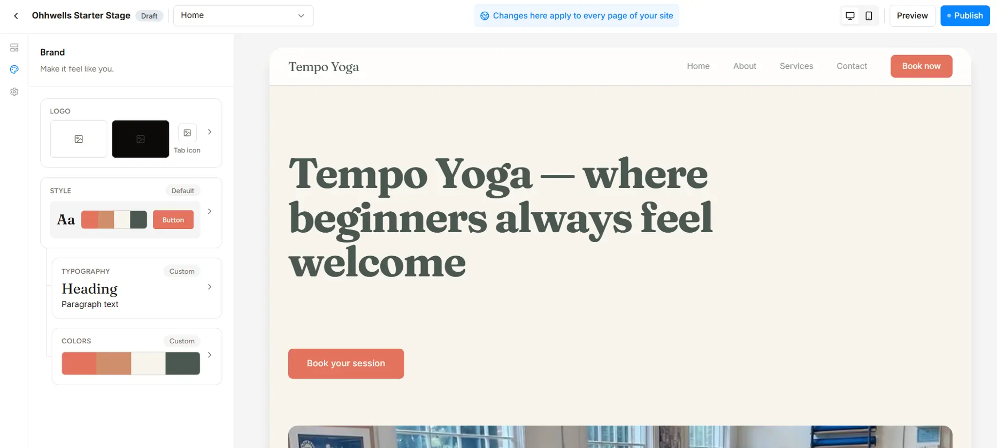
Do this first, or every section will look different. Enter your brand colours, pick your two fonts (one for headings, one for body), and choose a button style. In OhhWells this lives in the brand settings and every AI-generated section inherits it automatically — so you set it once, not per section.
No brand yet? Build a basic one in 10 minutes. You don't need a designer or a rebrand. A usable brand for a website is just four colours and two fonts:
Colours — pick four:
- Primary — take it from your logo, your shopfront, or the colour that shows up most on your Instagram. This goes on buttons and highlights.
- Accent — a second colour for small details and secondary highlights. Pick something that complements your primary rather than competing with it — a muted or earthy tone usually works better than a second bold colour.
- Light — your page background. Off-white, cream, or very pale grey. Pure white is fine too.
- Dark — for headings and body copy. Near-black or a deep grey/navy. Pure black looks harsh on screens.
If you're stuck, look at a photo of your space or product and pull the colours you'd want people to remember. Text on buttons and dark sections adjusts automatically, so it stays readable no matter which colours you pick.
Typography — pick two fonts:
- A heading font with some personality — this is where your brand shows.
- A body font that's plain and easy to read — this is where you get out of the way.
Safe pairings that work for almost any small business:
All of these are free (Google Fonts). Pick one row and stop there — mixing more than two fonts is the fastest way to look amateur.
Buttons: choose rounded or square corners, then never change it. That's your whole button style.
Enter these once. That's a brand — not a full identity, but enough for every section to look like it belongs to the same business.
Step 2: Collect reference sections you want to recreate
Don't start from your imagination — start from things you've already seen and liked. Before you prompt anything, build a quick moodboard of sections, not whole websites. You're going to hand these to the AI as the target.
What to collect (15–20 minutes):
- Screenshots of sections you like. Scroll through websites of businesses you admire — not just your industry. Every time a hero, pricing block, or testimonial layout makes you think "I want mine to feel like that," screenshot just that section.
- The URL of each one. Paste it next to the screenshot so you can go back and look at how it behaves on a phone.
- One reference per section you need. A typical small business homepage has about seven: hero, services, proof (testimonials or numbers), about, pricing or "how it works", FAQ, and a final call-to-action. Aim for one reference for each. Two is fine; ten is too many.
- A note on why you like it. "The headline is short and confident." "Prices are easy to compare." "Feels calm." This is the part you'll put into your prompt — it's more useful than the image itself.
Drop everything into one place — a Pinterest board, a Notion page, a folder on your desktop. Whatever you'll actually open.
Why this works: describing a section from scratch is hard, and "make it modern" gets you the same result as everyone else. Pointing at a real example and saying "like this, but for my business" gives the AI something concrete to aim for — and gives you something to judge the result against.
On OhhWells: you can upload your own images directly in the prompt bar, and describe what you're after in words — see Step 3 for how to phrase it.
Step 3: Prompt that section using the references you collected
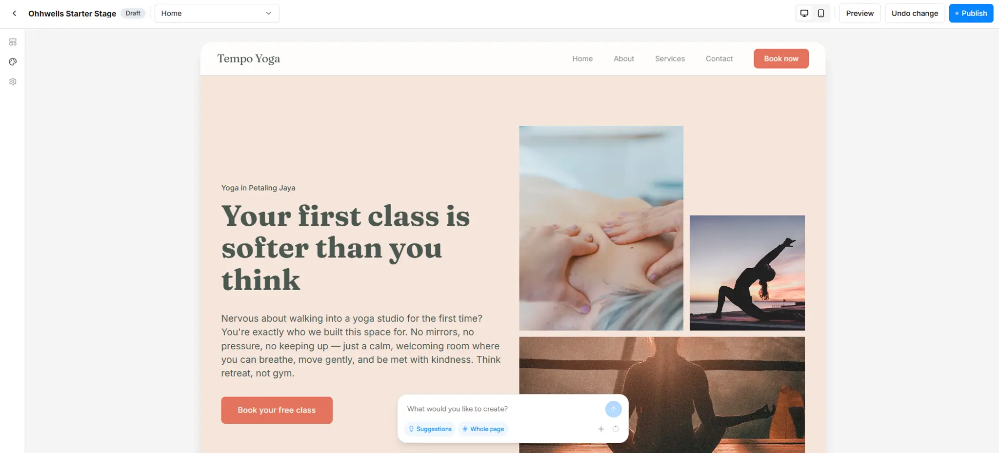
Take one section from your moodboard and describe it to the AI. A good prompt does two jobs:
- Tells the AI how it should look — your reference note from Step 2 (layout, spacing, where the photo sits).
- Tells the AI what it should say — who's reading, the tone of the copy, what kind of images to use, and the exact words on the button.
Hero section for a pilates studio in Petaling Jaya. Look: short confident headline, lots of breathing room, one big photo on the right — like the reference. Say: written for beginners nervous about their first class, warm and reassuring tone, images of small calm classes (not gym bodies). Button: "Book your free class".
No colours, no fonts — Step 1 handles those.
Step 4: Review, then tweak the prompt (don't start over)
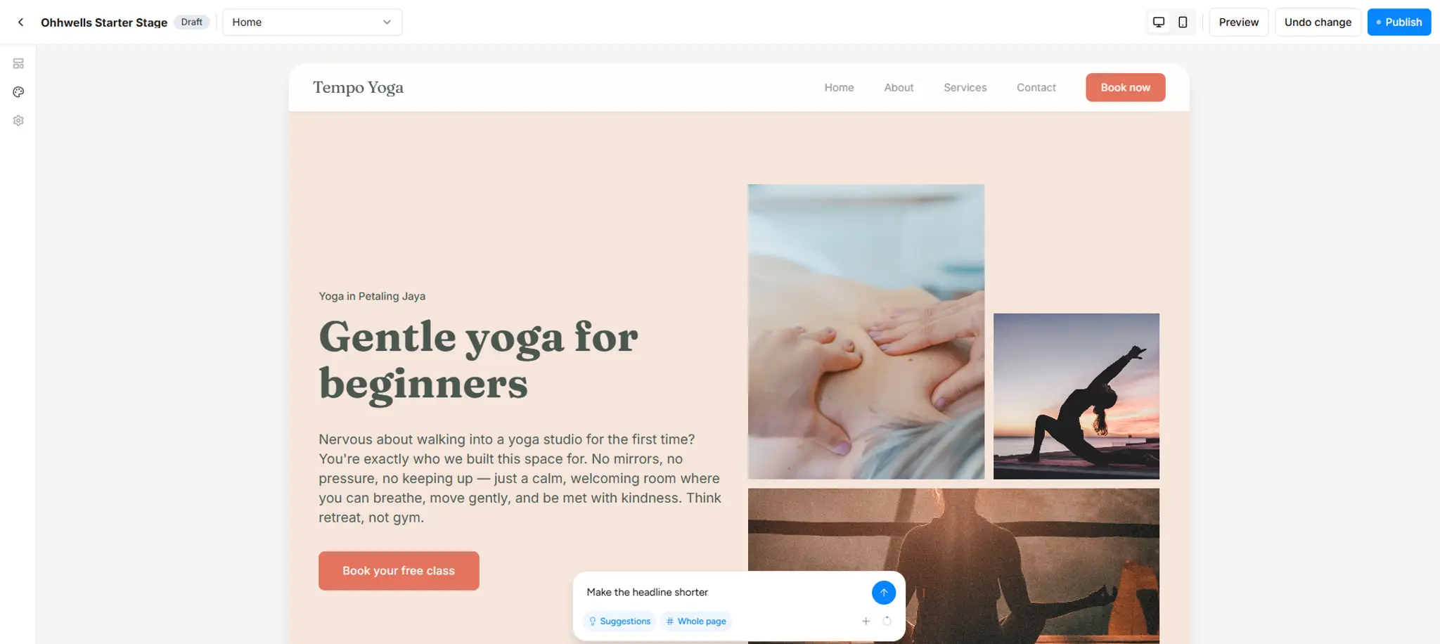
Look at what came back and ask three questions:
- Does it say the right thing? If the copy is off, tell it what to change: "Make the headline shorter and less salesy."
- Does it look like my brand? If it doesn't, the problem is usually Step 1 — go fix your brand settings rather than fighting each section.
- Is there one clear action? If a section has three buttons, ask for one.
Each regeneration in OhhWells uses one AI credit, so small targeted tweaks ("change the image to the left, keep everything else") are cheaper than re-prompting from scratch.
Step 5: Repeat for each section, in order
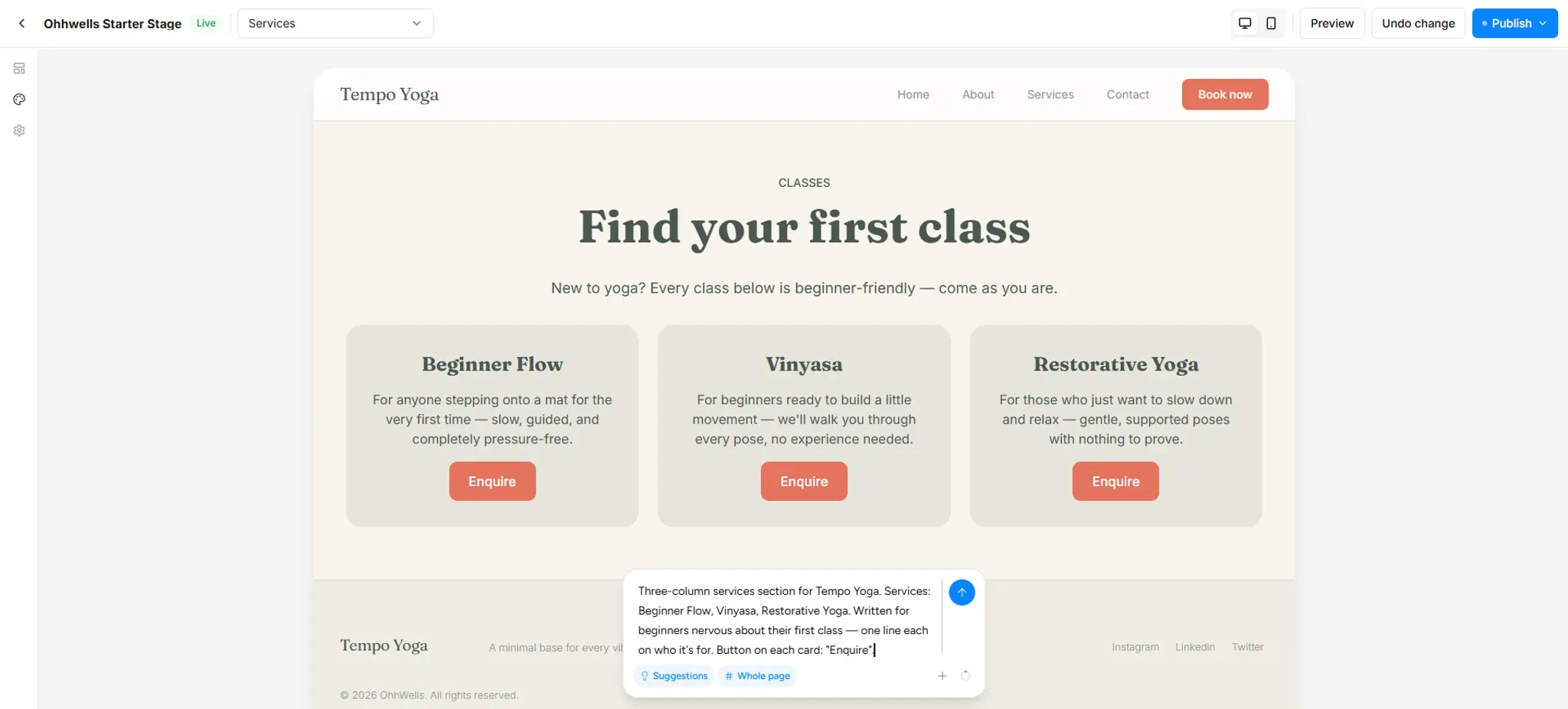
Go down your list from Step 2. Keep a consistent voice by reusing the same audience description in every prompt ("beginners nervous about their first class"). By the fourth section you'll notice the prompts get shorter because the AI already has your brand locked in.
Step 6: Check the page as a whole, then publish
Scroll the full page on your phone. Look for: repeated wording between sections, more than one main colour creeping in, and any section that doesn't earn its place. Delete what's not working — a five-section page that reads well beats a nine-section page that rambles.
Then finish it by hand. The AI got you 90% of the way; the last 10% is small edits that don't need a prompt. Click into any section and use the toolbar to:
- Fix the text. Change a word in the headline, correct your opening hours, swap the AI's phrasing for how you'd actually say it.
- Replace the images with your own. This is the single biggest upgrade. AI placeholder photos look like everyone's site; a photo of your actual space, team, or product looks like yours. Click the image, upload, done.
- Tweak the button. Change the label or where it links (your booking page, WhatsApp, a form).
- Reorder sections. Drag a section up or down if the flow reads better another way.
Use a prompt when you want the design of a section to change. Use the toolbar when you just want to change what's in it. Toolbar edits don't cost credits.
Then publish. Run it through a free website conversion score audit if you want a checklist of what to fix next.
Copy-paste prompts for the 7 most common sections
Swap the bracketed bits for your business.
5 mistakes that make AI-designed sections look generic
- Skipping brand setup. Every section gets AI's default taste instead of yours.
- Prompting the whole page at once. You lose control and can't fix one part without breaking another.
- Describing design instead of purpose. "Modern and clean" means nothing. "For nervous beginners, one button" means everything.
- Accepting placeholder copy. "Lorem ipsum" and "Your headline here" leak into live sites more than you'd think. Give real details in the prompt.
- Keeping every section it generates. More sections is not more convincing. Cut the ones you'd skip if you were the customer.
Try it free
OhhWells gives you 30 AI credits when you sign up (enough for a full page, with room to tweak), then 5 credits a day on the free plan. Your brand settings apply to every section automatically, so the result looks like yours from the first prompt.
Start designing your first section →Frequently asked questions

Keep reading
How Much Does a Small Business Website Cost in 2026? Three Ways to Pay for One
Build it yourself, hire a freelancer or use an agency? Here’s what a small business website costs in 2026, and what you’ll pay every time it needs a change.
Does Your Website Look AI-Generated? A 4-Point Check
Run four quick checks on your homepage to see if it looks AI-generated, from copy to photos, plus a simple fix for each one so it looks like your business.
Leaving Squarespace? How to Move Your Website Without Losing Your Google Ranking (2026)
Squarespace only exports part of your site. Here's what you can take with you and how to move step by step without losing your Google ranking.
Leaving Wix? How to Move Your Website Without Losing Your Google Ranking (2026)
Wix doesn't let you export your whole site. Here's what you can take with you and how to move off Wix step by step without losing your Google ranking.
Leaving WordPress? How to Move Your Website Without Losing Your Google Ranking (2026)
Thinking of leaving WordPress? Here's how to move your website step by step without losing your Google ranking, your domain or your email.
Why AI Websites All Look the Same (And How to Make Yours Look Like Your Brand)
AI websites look the same because tools share training data, component libraries, and vague prompts. Here's the five-step fix that works in any tool.